The Cumulative Sales vs. Goals graph on yourAnalytics dashboardis a simple report that holds a lot of information.
If you ever wonder how it's laid out and how to read it, here are a few points that may make it easier.
Looking at This Month
The goals graph plots your goal for the month against your sales progress for the month. Each column represents a day of this month:
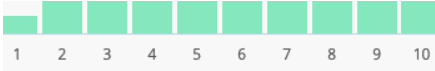
At the beginning of the month, you will see a series of light-green columns rising by an equal amount day over day:
The change of value from day to day will be an equal amount, as an accumulation of the month's daily goals.
How daily goals are defined
Daily goals are calculated automatically by dividing the month's total goal by the number of days in the month.
If you are using more than one multi-shop location, this is the total of all your stores combined.
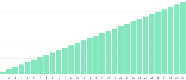
Let's say the month we are currently in is October, of which we have 31 days.
Then let's say that our goal for the month of October is $31,000. This means that Analytics will automatically define our daily goal as being $1,000. This way, if we hit or pass our daily goal every day, we will hit our monthly goal.
Note: There is no built-in way to calculate the daily goals differently using the Goals report.
How daily goals are illustrated
Once our monthly and daily goals are defined, the report will arrange them in a cumulative sequence. As in the example above:
- on day 1, our cumulative goal total will be $1,000
- on day 2, our cumulative goal total will be $2,000
- on day 14, our cumulative goal total will be $14,000
And so on.
How sales are illustrated
Once sales are made, they too are plotted as a cumulative total.
So, if on day 1, we sold $1200, our cumulative total would be $1200.
if on day 2, we sold $700, our cumulative total would be $1,900.
if on day 3 we sold $1,500, our cumulative total would be $3,400.
And so on.
As the month progresses, you will notice that the columns of days past are broken into two components: the goal position stays in place, and an additional bar fills the difference between your daily goal and your actual performance.
If the difference is marked by dark green:
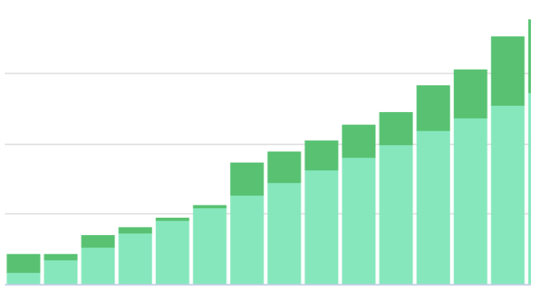
It means that your store performance to date is ahead of what your cumulative goal to date is. You're doing great! Keep it up.
If the difference is marked by red:
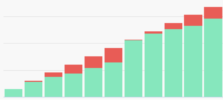
Then you may need to think about how you're approaching your goals. But don't give up! You've got the rest of the month to hit your goals.
Additional resources for goals
If you are looking for more ways to report on goal trajectory vs. actual performance, the Year Sales vs. Goal report will give you a similar illustration, but plot all daily sales to date from the beginning of your goal's starting month.
This could also be saved for multi-shop filters, or for different timeframes.
Additionally, the visualization of the Daily Targets report will show you some additional ways of thinking about your goals. (See Understanding Daily Targets report for more details.)