The Main Dashboard is your quick reference page for statistics about your Loyalty program. By navigating to Dashboards > Main Dashboard, you'll see an overview of key metrics like how many points have been earned and redeemed by your customers, what your most popular rewards are, and how your customers are earning their points.
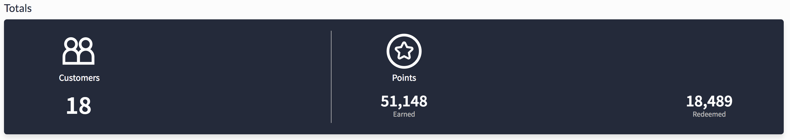
Totals
The Totals section is a quick tally of how many customers are using your Loyalty program, how many points have been earned overall, and how many of those points have been redeemed.
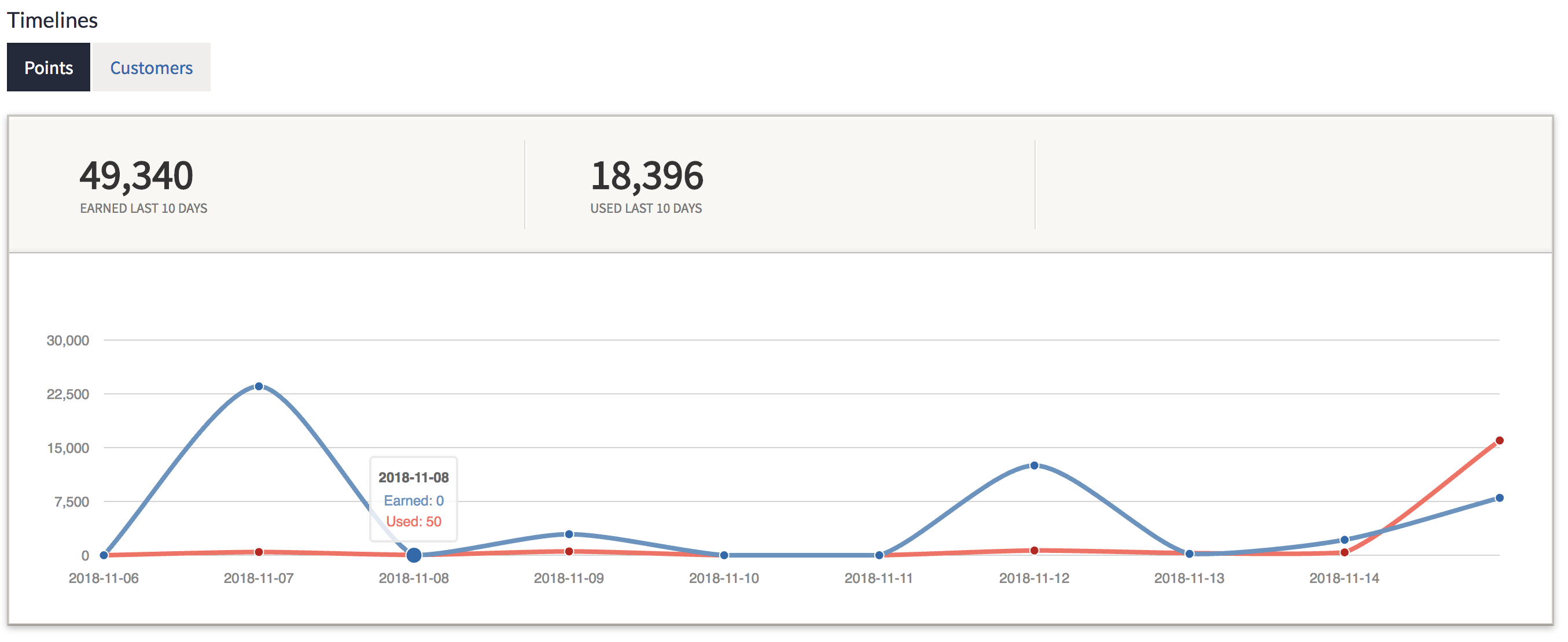
Timelines
The Timelines section offers two graphs: Points and Customers. Each will give you visual information on the last 10 days of activity.
The Points graph will show you a comparison of how many points have been earned over the last 10 days (in blue) and how many points have been redeemed during that same timeframe (in red).
The Customers graph will show you how many new customers have signed up for your loyalty program over the last 10 days.
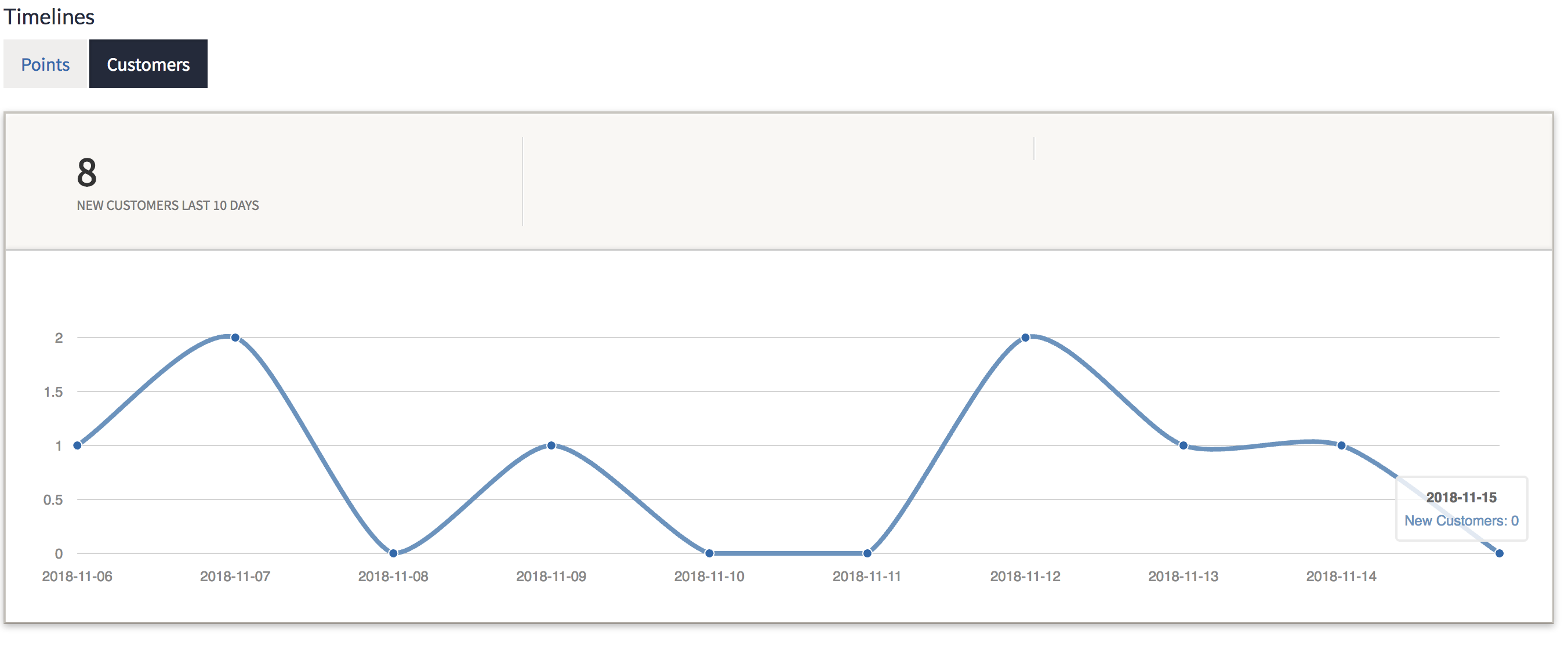
These graphs will help you track trends and spot recent spikes or dips in activity. Once you've identified patterns and slower days, you can start brainstorming ideas to bolster activity on those days.
Rankings
The Rankings section will show you your top 5 customers in terms of points-earned and your 5 most claimed rewards, depending on which chart you select.
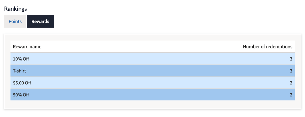
With this information, you'll be able to see if your top points-earners are redeeming their points or not and send out marketing emails or texts to entice them to redeem their points. You can also see which rewards are proving themselves to be most successful and which are not being claimed and adjust your rewards plan accordingly.
Usage Breakdown
The Usage Breakdown section will show you how your customers are earning their points.
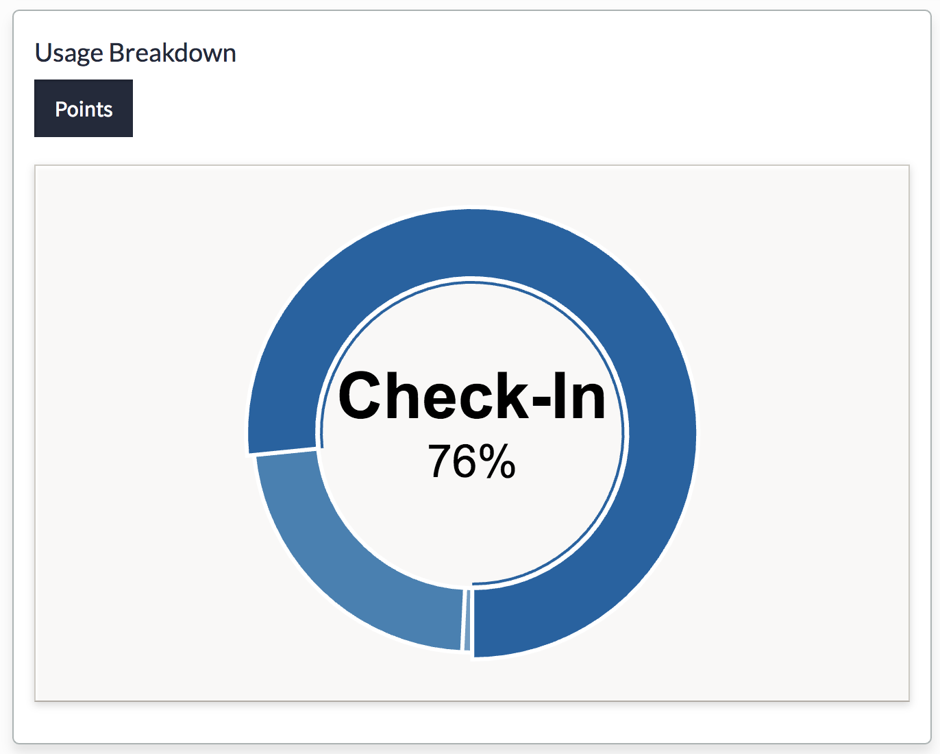
By hovering your cursor over the various parts of this circle graph, you'll be able to see what percentage of your customers' points were earned at the register ("Check-in") compared to how many were added to their accounts through the Loyalty Manager or how many were given to them through marketing emails or special days campaigns.
By checking your Main Dashboard regularly, you'll be keeping your finger on the pulse of your Loyalty program. You'll be able to react quickly to underperforming areas and make the necessary adjustments to improve the success of your program!