Visualizations are how we take innumerable rows of data and make them meaningful. With the right combination of dimensions, measures, calculations, and sorting, we can quickly identify outliers, patterns, and trends. Visualizations of reports are sent out in subscription emails, so it's beneficial to have a good understanding to make the most of your visualizations.
It's best to discover the visualizations yourself, to find which ones best illustrate the patterns you want to follow. Here are a few observations you can think about when preparing your own visualizations.
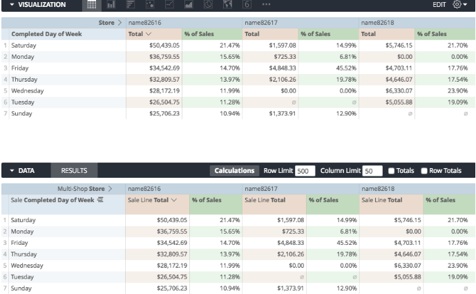
Check out the table visualization
While not much more exciting than the report builder, this is important because you can see which data is being included in your visualization:
Hide columns that you don't need
When hovering over any column title in the report builder, you will see the options to remove or hide from visualization:
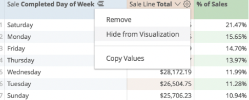
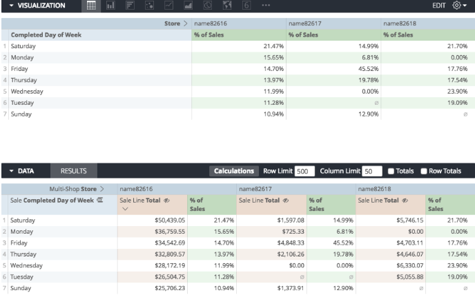
This way you can focus specifically on the numbers that you wish to measure. You will get an "eye" icon on columns that are hidden from the visualization:
Break out the types of measures
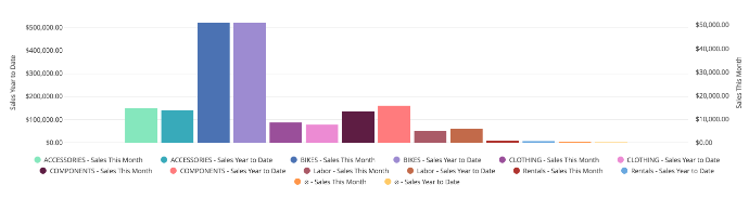
Sometimes graphs need to look at multiple sets of measures to be fully meaningful. Perhaps Quantity, GMROI (gross market return on investment), a dollar amount, or inventory turns might be important in one of the visualizations.
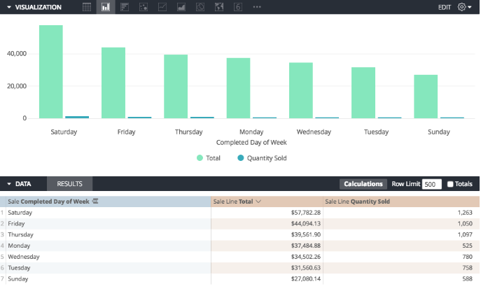
For example, I may have sold 1,000 products on Saturday for a total of $50,000, but if I measure them on the same graph, I won't be able to read the quantity:
Using the gear icon on the right-hand side of the visualization bar, I could navigate to the Y axis:
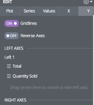
Then drag Quantity Sold down to the Right Axes section:
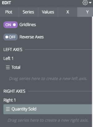
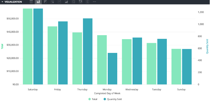
This way, I measure the dollar amounts on the left-hand side of my graph, and measure the quantity amounts on the right-hand side:
Hide rows
A good way to gather sales data from different time frames is to sum their respective totals, and then show only the first line of totals in the visualization.
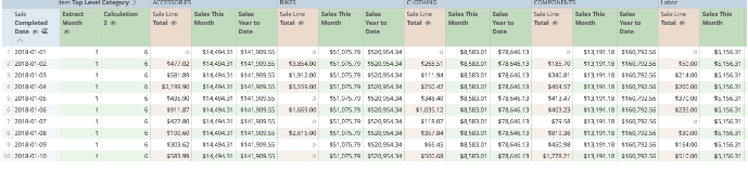
If my raw data looks like this:
Then after hiding columns I don't need, I can navigate to the gear icon on my visualization bar:
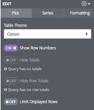
And then select Limit Displayed Rows:
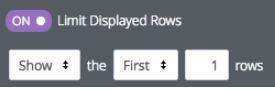
Here, I will opt to only show the first row:
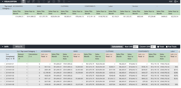
When I display the visualization as a graph:
This is a more meaningful visualization.
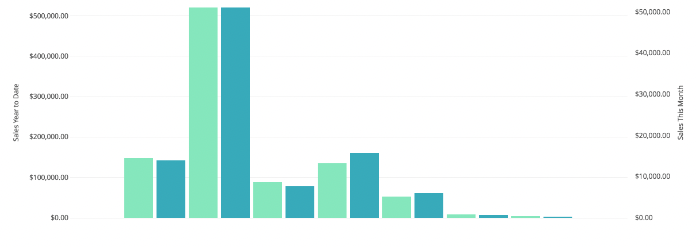
Change the colors
On the Series tab, you can access the colors displayed on your graphs:
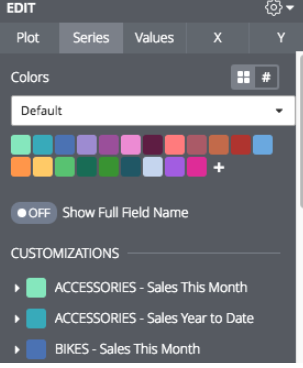
Here you can choose a color from the pallet, or copy and paste the color code to harmonize your data:
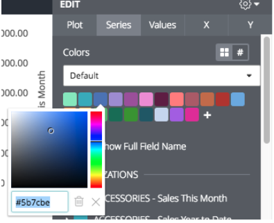
This makes your graphs readable as quickly as possible:
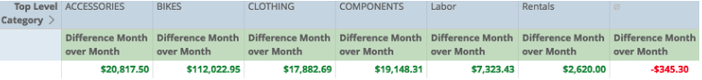
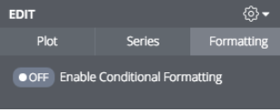
Give tables conditional formatting
If we're using a table to compare last month to this month, for example, we can use conditional formatting to respond to numeric values, say to highlight negative and positive change.
Under the formatting, let's enable conditional formatting:
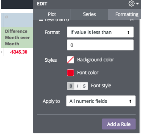
Start by selecting If the Value is less than 0:
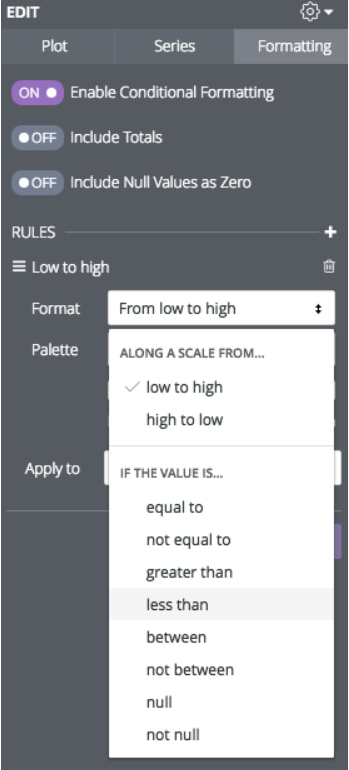
Now we can set the visual rules, in this case, if the change is less than 0, I will make the font red and bold:
Now, let's add a new rule for if the values are greater than 0:
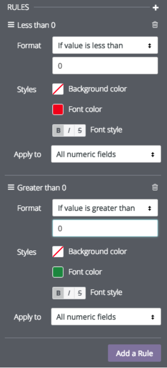
And our table follows the rules that we have set!